Superduper Portfolio

SIGNALGRYD

The Project

Breaking the chains of a templated website builder

SIGNALGRYD’s online presence begun in 2014. Without prior knowledge that the discipline of online media demands, their initial requirement of a website was met through an all-in-one solution provided by Squarespace. Which at that time although does not seem to be the best choice, certainly was the most convenient. Squarespace is a website builder ideal for small businesses that are just starting out.

However, the simplicity of Sqaurespace lacks core features any serious business needs in the digital space. For example, the website design aspect is strictly limited to the fixed templates provided. Although simple tools were provided in their drag and drop builder, customizations still require coding knowledge beyond HTML and CSS.

Our initial findings revealed that their site was poorly optimized for SEO due to the website’s template structure. This results in sections that weren’t search engine friendly, and were not indexed accordingly.

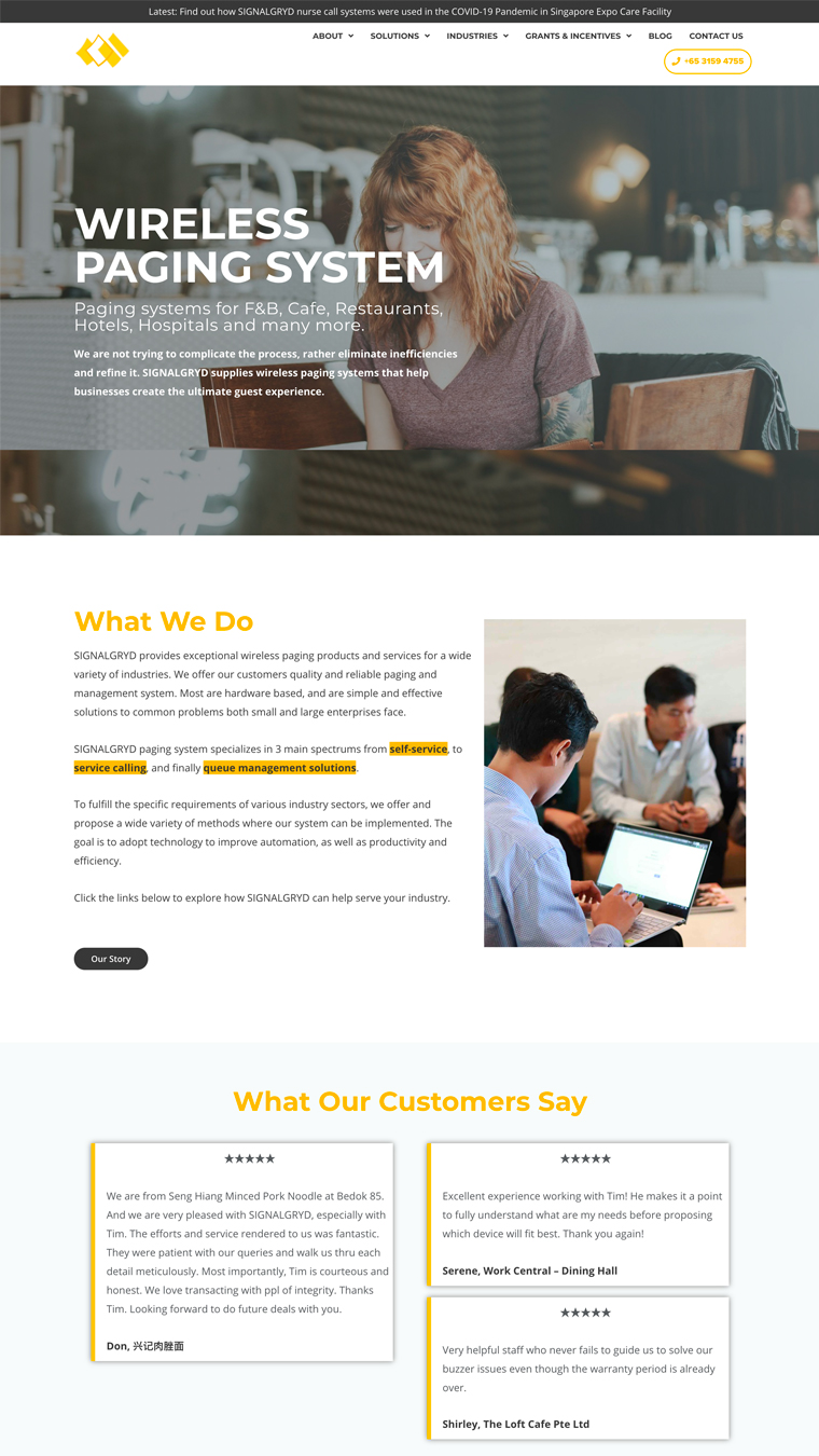
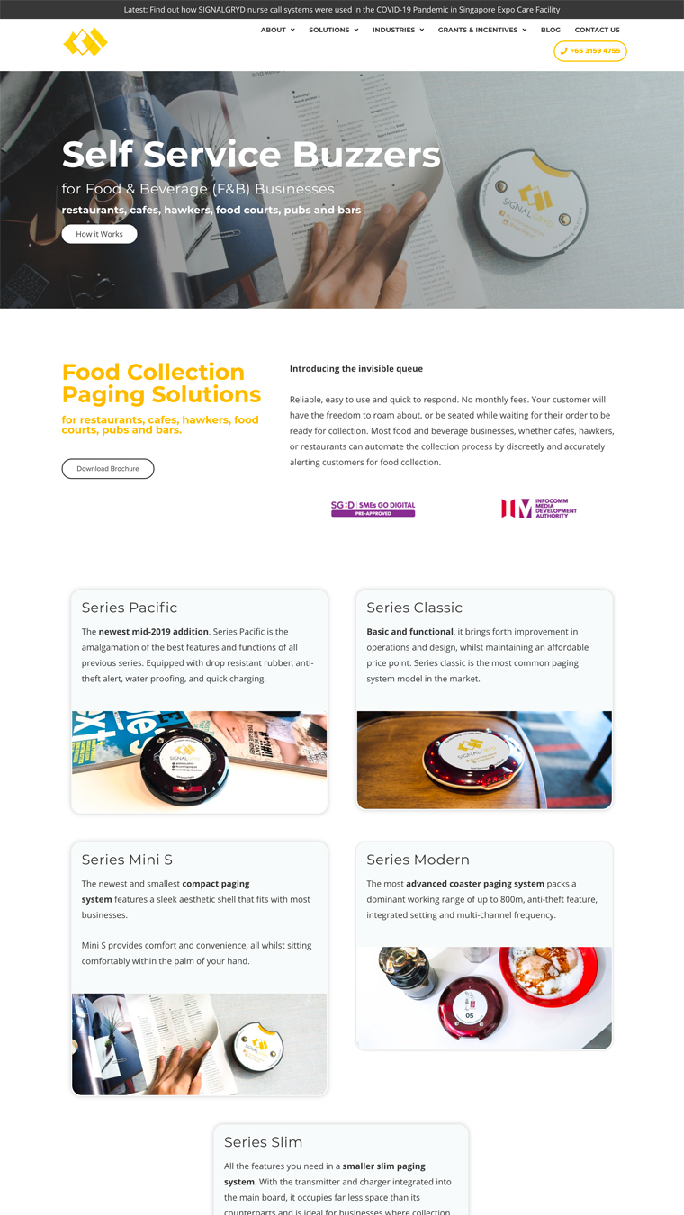
An entire transition and overhaul was required to move from Squarespace to a fully custom design on WordPress. SIGNALGRYD’s focus was to showcase their products as well as convey clear ease of use of their solutions through video pop-box.

Our Focus

  • Branding
  • Logo Design
  • Website Design
  • SEO Implementation & Optimization
  • Analytics Tracking
  • Product Photography
  • Content Strategy
SIGNALGRYD-Homepage

Typography

When it comes to the selection of typography and fonts in web design, there is a need to be as clear as it is beautiful. Otherwise your visitors will not respond to it. Having breathtaking designs with illegible typography will confuse your visitors, which result in exaggerated bounce rates.

The fonts we implement, represents the distinct identity of SIGNALGRYD’s brand.

These have been chosen specifically because of the personality that the bring to the written word. Do not use fonts that are not defined here – to do so would be damaging to the overall perception of the brand we’d want to convey.

SIGNALGRYD Font Pair

Color Scheme

Color plays in incredibly important role in your brand identity system. Every color and shade has been chosen for a specific purpose and plays a vital role as we build your brand in your communications.

SIGNALGRYD-Mockup-2

The Superduper Solution

Moving from Squarespace to a fully customized WordPress website was effectively breaking the limiting chains of a simple website builder. For example, within a 5 months run from their launch of a new website design and SEO implementation – we observe a jump in search ranking from page 3 to within page 1 of Google search results. In terms of SEO, this organic growth is unprecedented within such a short span of time. Albeit, their competitor’s poor SEO strategy were also attributing factors. Within 2 years, they have continuously been in Google’s search results page 1, for more than 5 core keywords related to their business.

A modern website, with a conscious design methodology coupled with professional photography has resulted in increase in data metrics attained from their website. We then asked to see web and customer data, statistics and trends, analyzing all insight that was at SIGNALGRYD’s disposal in order for us to understand their users’ behavior. Together, our teams compiled a playground of information to work with, and these learnings were reflected in the final product.

With support in other branding aspects, SIGNALGRYD has also extended both our contract and the scope of cooperation with our service specialist, who continues to help with the company’s rapid growth. This highlights a level of trust that we’re incredibly proud of, and we look forward to standing by SIGNALGRYD’s side as they continue to thrive.

Inspired?

Get your custom website today.

Other Superduper Works

Website Design

Fight Rhythm

An e-commerce store, optimized for conversion and integrated with backend data capture to curate custom marketing efforts.

Leftright Corporate Portfolio Showcase
Website Design

Leftright Corporate

Tasked with building a complete new brand from the ground up, our focus was in establishing a separate and unique identity, with emphasis in the brand’s direction.